
Disclaimer : I care and because I want to.
![]() for the Giovinco outfit
for the Giovinco outfit
![]() for the Bradley/Altidore outfit
for the Bradley/Altidore outfit
In a nutshell : White with a large red horizontal band and a smaller blue band above it
The inside collar says : unknown
The outside back collar has : “All For One”
The jock tag position has : a maple leaf, because we’re Canadian, unlike Vancouver or Montreal
The side Adidas stripes are : red 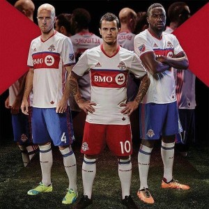
Well, that was underwhelming.
We had heard through the grapevine, that the away kit was going to be predominantly white. So that was correct.
Then there was the hint that a “non-traditional TFC colour was going to be incorporated”. Factual, sure.
Then there was the old-timey TV promotional spot to hype the launch. OK, sweet, so it was going to look like the Blizzard. Or Metros-Croatia. Probably not vanilla Metros (but one can dream).
The jersey is white with a red horizontal band across the chest and a thin blue stripe above it. Red shallow V-neck and red and blue trim cuffs. I really dig the cuffs, simple with equal weight for the blue and red. From the images and video, not much in the way of details of the shirt, which I’m sure will come out in the coming days.
So the homage to the past is not, in fact, an homage
whatsoever, as no modern Toronto soccer team ever had a look close to this. Guess having blue in the kit is a metaphorical bone thrown to the 15 people who follow Toronto FC who once attended a Blizzard match as a child.
I don’t fear blue for this team, even as trim, and it should never have been discounted as part of the identity. The Blizzard had blue in their uniforms and they were a red team. I’ve always felt Toronto was a “blue” city, and that their soccer team omitted it was a mistake (thank you branding and marketing). Don’t get me started over the basketball team…
So all things being fair and equal, though the shirts are kinda simple given all that’s on offer from the rest of the league. However, the full kit is where it gets kinda nice.
The more I look at the full uniform with the blue shorts with red stripes, the more I feel they got the look right. Still not much of a throwback, but this is much closer to what I would want out of a Toronto kit. Not necessarily a Toronto FC kit, but a Toronto kit. Representing the city of Toronto. This makes me happy, and makes an otherwise ordinary shirt look very nice.
Also, red away shorts? Compared to red home shorts? Really? I know the difference being the adidas stripes, but really? It’s an away kit. A change kit. There isn’t much change, is there?
Note 1 : could be the only time ever Bradley and Altidore are rated over Giovinco
Note 2 : way to go internet! You leaked almost the rest of the league except this one.
Get if you : are ordering the blue shorts too, buy-in that this is a proper throwback/homage to the teams of the past.


March 1, 2016
I’m ok with it. the shirt’s kind of meh, very chicago fire and the way bmo is snugly within the stripe makes it look like the entire stripe is about bmo, which isn’t ideal.
Blue doesn’t bother me too much, and i think it looks better with the blue shorts.
Hadn’t noticed the socks say all for one, meh to that.
would need to see it up close to make sure there’s no embedded nonsense or other small details that bother me, but generally I’m ok with it, not inspired to grand passions either way.
March 1, 2016
The blue shorts are growing on me. Damn it. The hyper focus on the BMO is irritating. As for the nod to Toronto’s footy history, kind of wish they’d gone even further and made them more retro. Or somehow incorporated the old badges into the kit somewhere – maybe on the trim or on the sleeves. The two years in advance part is interesting.
March 1, 2016
I think it’s kinda boring, but I hadn’t seen the blue shorts until the photo you posted here. It’s a bit better that way. But certainly a bland enough shirt that they didn’t need a silly promo video about it. All this honouring our history stuff from every MLS club is really grating. TFC’s history started in 2007, and the rest of the league in 1996. Stick to that and own it.
Also, I’m tired of “All for One”. So many things about this club are so forced and contrived. I wish they could skip all the marketing, hype, and promo crap and just get to the games. I guess that’s the nature of the business / the world these days. Gotta get hyped!!!
Sorry to be so bitter. But I feel this is the right place to rant about these things.
Anyway, the kit is ok and certainly inoffensive unlike Columbus. I was kind of hoping for something a bit different, even if it was crazy like NYCFC’s. At least they are trying to be interesting.
BTW for a bit more detail you can sorta see the back of the kit here:
http://www.torontofc.ca/kit/thestory
Cheers folks!
March 1, 2016
always a good place for a bitter rant.
I don’t get the back embedded stripe thing. at all.
March 1, 2016
We’re pretty much all in the same mindset about the circus and the over marketing of everything – it is the scourge of North American sport. Rant on good sir!
March 1, 2016
In addition to my esteemed colleagues, this is safe space to have a rant.
I’m in full agreement with the hype machine. I can’t imagine it is this relentless in other cities, but that’s because this often beyond necessary.
I was secretly hoping for a reprint of the Blizzard kit : all white with half red/half blue sleeves. I would’ve take a plain white kit with red trim and blue socks and shorts like Metros-Croatia. Those would check the boxes of history and different, but no. We got this.
Though the write-up about Toronto soccer history was excellent, it’s a bit of a stretch since the only thing holding them together seems like the colour blue on this away kit. Which if we’re talking about history, should’ve thought of that day 1, but what do I know.
March 1, 2016
Thanks everyone!
March 1, 2016
Captain America is now adding ‘murican colours to his jersey. 2017 home kit will be all stars & bars and not a single leaf.
January 29, 2020
Just ran across this looking for something else. I loved this jersey and ordered one as soon as I saw it. A very long time ago I lived in the GTA and went to as many Metros-Croatia/Blizzard games as I could. This kit felt like “home” for me. I realise that TFC is something different, but I regard it as what I would call in German the “Nachfolgerverein” of the Metros-Croatia/Blizzard. That’s why I have supported TFC from afar since their inception.
January 31, 2020
Welcome Chuck!
Seeing some of the kit offerings lately, this shirt is practically exotic! I’m glad this kit sparked those memories, as, the Blizzard in their prime was a few years before my time.
Glad you are enjoying it from afar. Thanks for the visit.