Disclaimer : I care and because I want to.
![]()
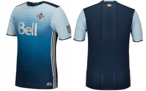
In a nutshell : Much nicer and classier than a description can provide
The inside collar says : Our All. Our Honour.
The outside back collar has : nothing
The jock tag position has : “Since 1974”
The side Adidas stripes are : white 
The first leak I saw of this must have been a flat representation of the shirt as my initial reaction was “stupid golf shirt”, but then when a photo was released with one of the players wearing it, I could see the shoulders, because it meant that the same pattern didn’t wrap around the entire kit. I was officially jelly.
I’m still a little jelly.
Gradients are tricky business, but they are best done between two shades of the same colour and not “colour-to-white” or “black-to-colour”. And here we have the risk of a sky-blue to navy-blue gradient going down the shirt. Within the pattern of the shirt is the diamond with horizontal stripes, inside another diamond with horizontal stripes. In description this shirt should be loud, too busy and down-right annoying.
But it’s not.
White Adidas side stripes and a navy ringer collar with buttons down the middle. Damn, this is nice.
This reminds me of TSV Munich 1860’s kit from 2013, a.k.a. “The International Kit of Leisure”. I love that kit. It’s not exactly (mostly from the back), but you get the idea.
Only taking a mark away because it CAN look busy, even if it really doesn’t. I accept, it’s nit-picky, but it’s still top shelf.
Get if you : like great kits, like great uses of colour and patterns, like your sponsors to be as washed out as possible


