Disclaimer : I care and because I want to.
Vancouver Whitecaps home
![]()
In a nutshell : simple, modern without being garish
If Vancouver is fighting to not have boring template kits from Adidas, then they are making the battle count.
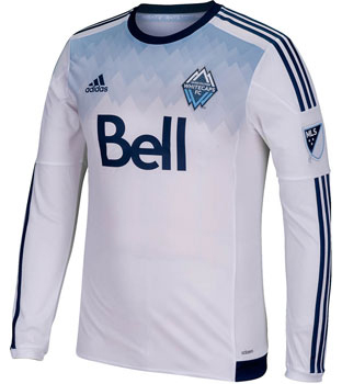 Starting with the obvious pattern, definitely a fan of the gradient ‘mountains’ that start from the armpits up to the shoulder. It’s wonderfully subtle as it still uses the light blue in the kit, implements the design feature of the badge and, most importantly, at a quick glance, this is still a white shirt. Solid use of the navy trim, as per previous efforts. It’s a classy bit of kit.
It loses a point because of that west coast revisionist history “since 1974” imprinted below the collar on the back. Certainly it was less offensive than Portland’s claim, but there was a year there was no professional club in Vancouver, and for the following 15 years they were definitively NOT the Whitecaps, in spirit or otherwise.
Get if : You like upgrades, need more triangles to represent mountains by your shoulders.
Leave a Reply