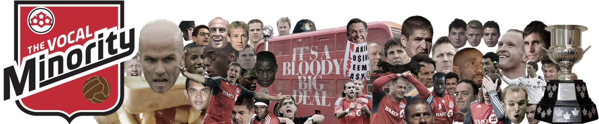
Kit Nerd Corner : Philadelphia Union away
Disclaimer : I care and because I want to. Philadelphia Union away In a nutshell : Why bother trying. Philadelphia have been on a slippery slope downward. Their first away kit was a decent reverse of the home kit. Their next kit was their home kit under brighter lights. Then this happened. It’s so ordinarily white. The navy trim is so dark it looks black, and it looks super boring on there with the old gold stripes. This...
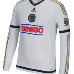
Kit Nerd Corner : New York Red Bulls home
Disclaimer : I care and because I want to. New York Red Bulls home In a nutshell : Reverse Arsenal with animals. This is the most contrasting kit of the bunch. On the one hand, I’m kind of upset how Red Bull circumvent the advertising rules by owning the team. On the other hand, it is a marketing masterstroke. Use corporate symbolism as the badge, use badge elements EVERYWHERE. It’s a vicious cycle. All of the usual elements that...
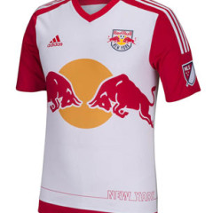
Kit Nerd Corner : Vancouver Whitecaps home
Disclaimer : I care and because I want to. Vancouver Whitecaps home In a nutshell : simple, modern without being garish If Vancouver is fighting to not have boring template kits from Adidas, then they are making the battle count. Starting with the obvious pattern, definitely a fan of the gradient ‘mountains’ that start from the armpits up to the shoulder. It’s wonderfully subtle as it still uses the light blue in the kit, implements...
Episode 76 – 15/03/05 #YcantUBhard
The gang is all back, predicting league outcomes, forwards outlook, retirement of a “legend” and another insane round of “Would You Rather” (we’re sorry and you’re welcome). In this episode, Kristin admits to fear of most of the other panelists, Mark gushes for a scrumpy ear worm, Duncan pre-calls out a certain head coach, and Tony calls for the liberation of three former badge icons. Click here to...
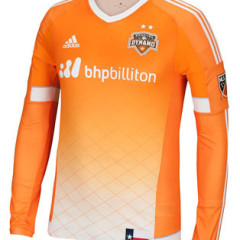
Kit Nerd Corner : Houston Dynamo home
Disclaimer : I care and because I want to. Houston Dynamo home In a nutshell : Finally, a Houston kit with some real character Really digging the gradient of orange down to the white at the bottom and the diamond/fence pattern pinstripe print of the shirt. Very happy to see them drop the awkward “Space City Blue” that they use in their badge. It’s terrible. Here’s a team that could do a better job of using...

Where Our Podcast Is Found

It’s Old But Still Proud Of It