Disclaimer : I care and because I want to.
Toronto home
![]()
Jock tag : a maple leaf with the CN Tower over top of it.
Back of the neck : All For One
In a nutshell : the nicest training shirt you wouldn’t pay full price for.
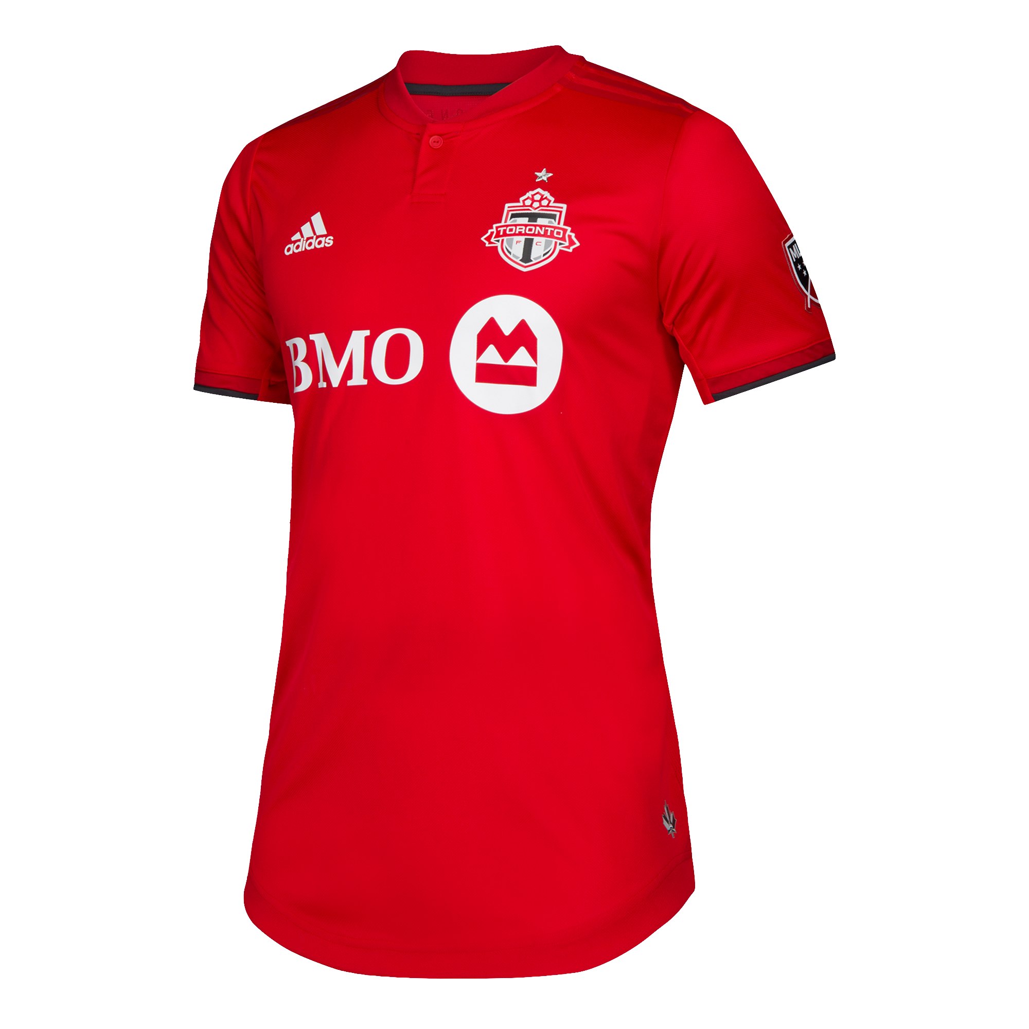
Toronto is one of the later sides to produce their new kit for the upcoming season. If you saw the leaks earlier in the month, that was it but it was slightly nicer than that.
It’s an all red affair, red ringer button up collar, red Adidas stripes from collar to the top of the shoulder on an already red shirt. The cuffs have a slight dark grey trim on the half facing away from the body.
It’s not a terrible shirt. Like, if you were wearing a version of this for your Wednesday night competitive men’s league at the docklands, you’d look pretty sharp. But is this the kit of a MLS side? Any major side? Does this kit look like it is even remotely worth $120+?
No.
It looks phoned in. It looks like minimal effort.
The signage at the launch party had more thought put into it.
My (terrible) suggestion : make the top shoulder stripes light grey OR make the collar fabric dark grey but leave the button red.
Get if : you collect all the shirts, like red with red, adore overpaying for things
Vancouver home
![]()
Jock tag : the old 70s Whitecaps NASL badge
Back of the neck : nothing!
In a nutshell : fucking nailed it.
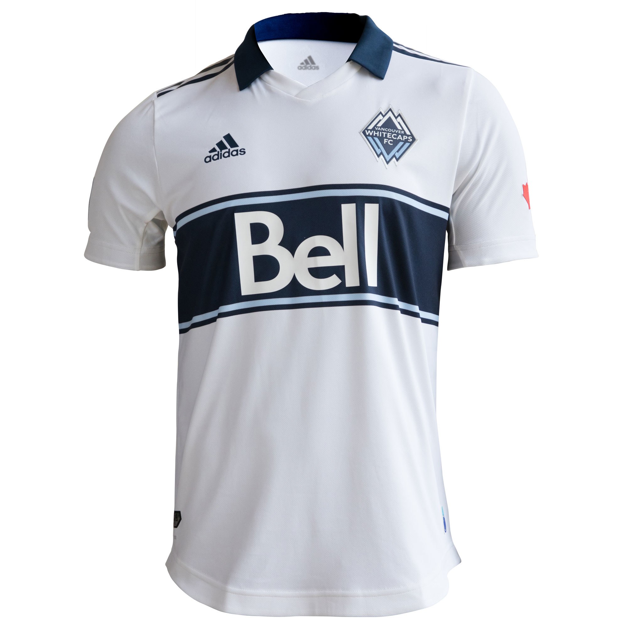
We’ve been well documented crapping on the “40 years” revisionist bullshit that many western MLS sides propagate, and with good reason as it’s misleading and co-opting a history they’re only attached to in name.
However Vancouver has come out with a kit to celebrate something that actually is 40 years old – their 1979 NASL Soccer Bowl championship winning side.
It’s a white kit with a navy rugby-style single wide horizontal band, with a sky blue-then-navy trim around the band which extends around the back as well. The Navy collar sits atop a white v-neck, navy Adidas striping from neck to top of the sleeve, and a red maple leaf patch on the left sleeve with “1979 Champions” emblazoned inside in delightful 70s font.
Now if you’re going to own this beauty without a name and number, you are doing yourself a disservice. The font is in red and it’s perfect.
Like I said, fucking nailed it.
Get if : you like nice things, we’re waiting for the perfect Caps top, you were at that game 40 years ago… treat yo’self.
Montreal home
![]()
Jock tag : the bell
Back of the neck : monocolour Montreal civic flag
In a nutshell : they nailed the important parts

Montreal, like Atlanta, will be tied forever to the Milan derby based on their decision to be black stripes with blue or red respectively as their other colour. And sometimes, the parallels are obvious, because you can only do stripes so many ways, but the Impact have managed to dodge it again.
The top is predominantly black, with blue thin striping, fading mid-torso with thin black stripes until completely black at the bottom. Black sleeves, black ringer collar, black back. Blue Adidas stripes are on the sides from armpit to hip.
The front is nice, but it’s kinda boring overall. Like, you NEED, a name and number on the back to break the monotony.
Get if : you felt Montreal should be darker, like the fade on the front, like to bake in the sun on a summer day at the stadium.
Real Salt Lake away
![]()
Jock tag : “05” inside a beehive
Back of the neck : “As One” with crossed swords
In a nutshell : the red ink nozzle needs replacing
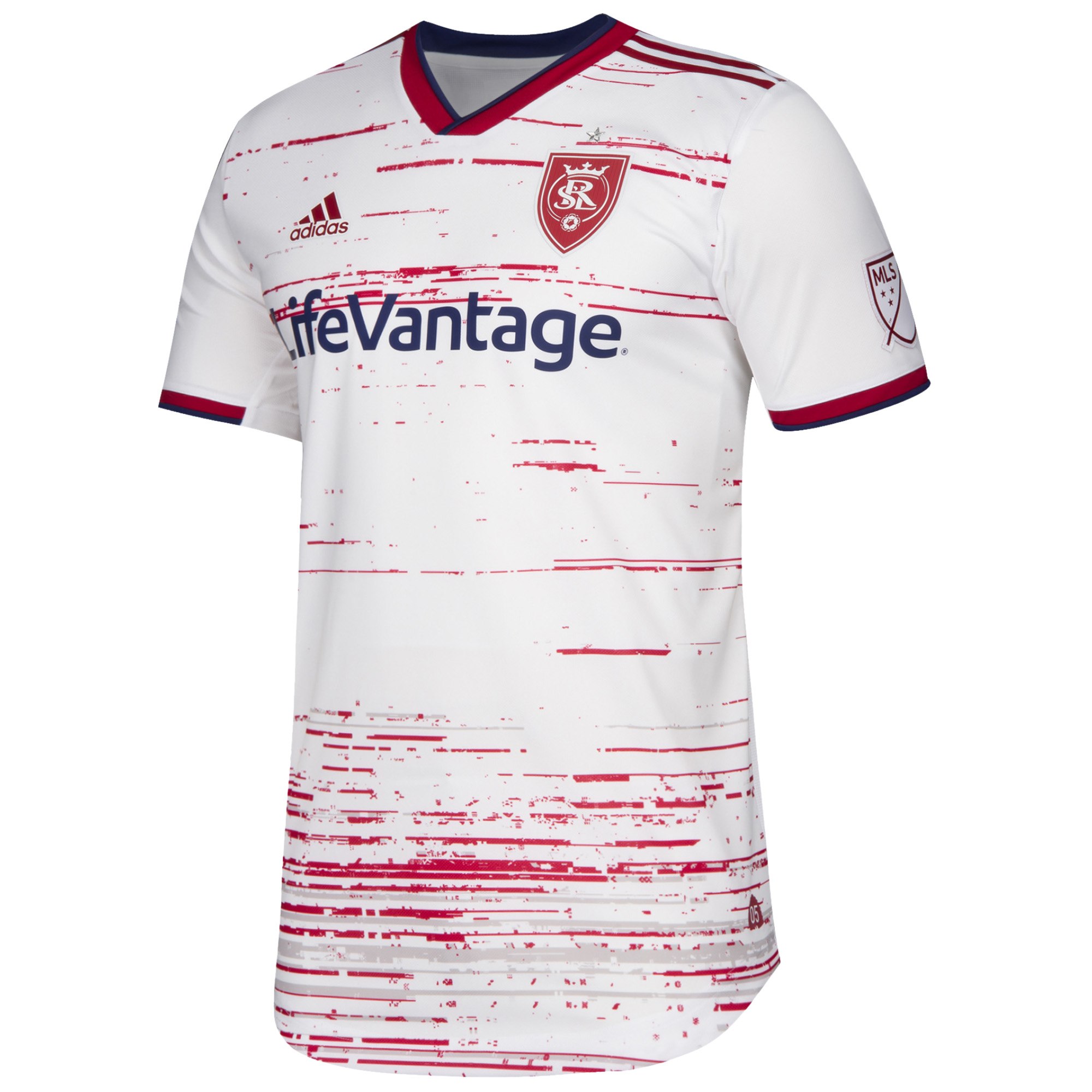
MLS is all in with this “everyone wears white away kits in this league” idea. There are six new white away kits, adding to the three or four (I’m so bored by it, I’m not sure who all has them any more) that came out last year, but this is at least the most interesting of the lot this far.
White shirt with maroon and navy cuffs, maroon Adidas stripes at the top of the shoulder, maroon and navy 90s style v-neck (or the JVC-era Arsenal collars), and then there’s the chest which has a bit of maroon horizontal ink blotted striping in random lengths and thickness, which increases in frequency in the bottom third mixed with a grey ink blot striping.
While this shirt is a little shocking, I admire the attempt for something different. Genuinely, my favorite part is the monocolour maroon version of the badge. It looks amazing in this form and I would be very ok if they stuck with it. They won’t, but it’s very class.
Get if : you don’t mind the stripes, you get a lot of bloody noses that you’re unaware of before it’s too late, like a sweet interpretation of the badge.
Sporting KC home
![]()
Jock tag : flag of diagonal stripes
Back of the neck : For Glory. For City.
In a nutshell : my homework got run over
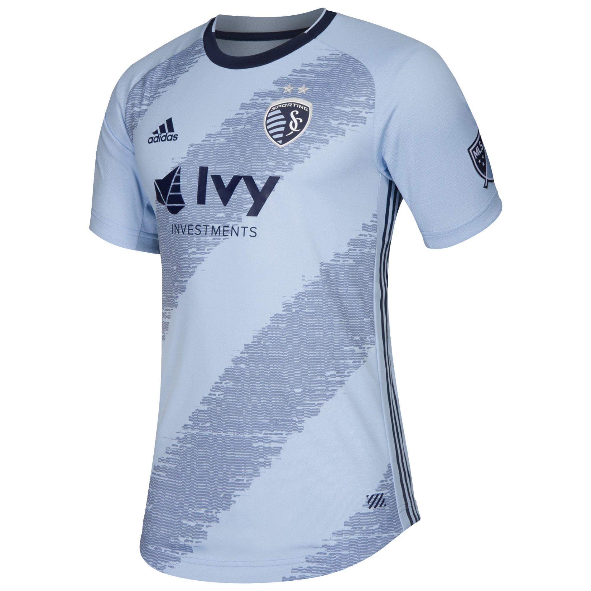
Full disclosure, I strongly dislike Sporting KC but they’ve had some very nice kits. I’m strong enough to admit it. I know the reactions on the podcast we’re negative, I went to bat for this.
We have their traditional pajama light blue tops with the raglan (think softball style) cut of the sleeves, navy ringer collar, light blue cuffs, navy Adidas striping down the sides from armpit to hip. The chest looks like a tire tread with a shade of blue in between the navy and pajama blue, but not quite a tread. The pattern looks like horizontal lines shifted to make a diagonal, then vertical sections of it we’re slightly nudged upward to complete the effect.
Up close, I admit this kit is a bit messy, but from the stands/on TV, these are going to look fantastic. Diagonals, as a design, are often limited to a sash, which is fine, but there’s plenty of play in that space, as far as kits go.
Get if : you don’t mind a little wacky, like diagonals, want to go as an accident victim for Halloween
Portland home
![]()
Jock tag : none
Back of the neck : crossed axes
In a nutshell : maybe flawless
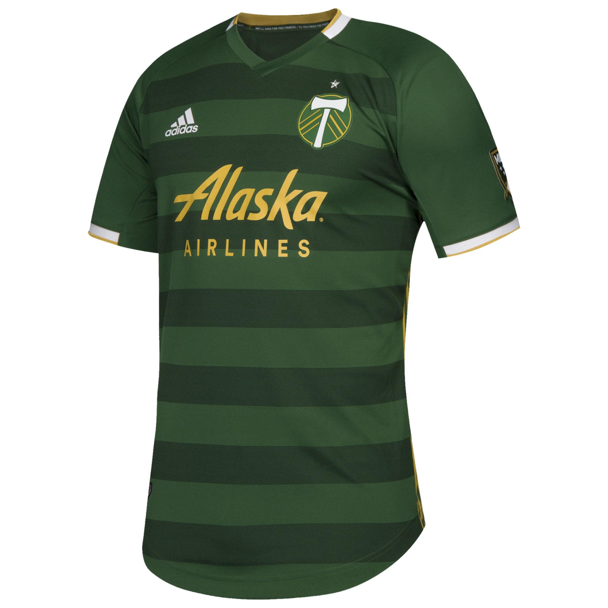
You know when you hear a song for the first time and your ears just perk right up and you want to consume it? Or your first real crush in high school, passing them in the hallway and your heart goes aflutter?
This one is kinda like that. I mean, MLS standard. So like loving Limp Bizkit’s “Counterfeit” and the awkward but super cute girl in your french class (that was me, don’t judge… or do, doesn’t matter).
Portland’s offering is a forest green kit in a raglan cut, v-neck collar that’s green on the bottom third, and the rest is white with a gold trim, green sleeves with white half cuffs and gold trim, two-tone green sublimated horizontal stripes and gold side Adidas striping from armpit to hip.
The standout is the balance of gold and white as the secondary colours. In this layout, they’re nearly even in amounts (including the gold sponsor and white manufacturer marking). Most Portland kits have leaned on more gold than white, or more white than gold. The collars and cuffs look so nice, I keep referring to the image in case it was imagined incorrectly.
Get if : you want the best (and you deserve the best), like hoops (which I do), we’re friends and looking to get me the perfect gift
Columbus home
![]()
Jock tag : “Charter Member #01”
Back of the neck : black shield with 96 in white
In a nutshell : seen it before, but not mad about it
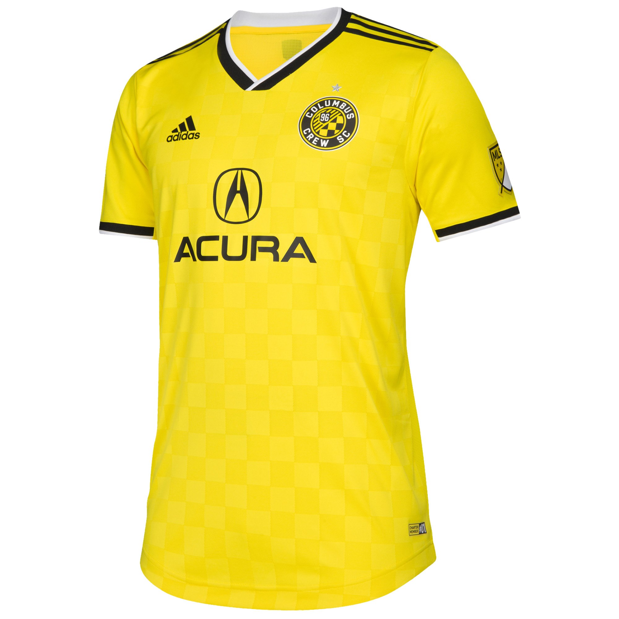
If you were to do a mashup between the last two yellow Columbus kits, this is the child borne from that marriage.
The checkers are sublimated back in the chest, the same jock tag as before, black with white Arsenal-90s v-neck collar, black with white half cuffs.
I feel like the collar, which I’ve liked on other shirts, is a bit much here. I might have been more at peace with it if the stripe inside was yellow. Also, because I feel like I’ve seen it before, not super new. I still like the shirt, but had this been the first ever Crew kit I’d have laid eyes on, I’d probably be looking to buy it.
Get if : you love checkers, want a kit that doesn’t completely remind you of Precourt, you’re happy it isn’t an Austin kit
San Jose home
![]()
Jock tag : SJ74
Back of the neck : Forward As One.
In a nutshell : it’s a template, but with their twist on it.

I like San Jose’s blue and black more than Montreal’s.
Ok, it’s really just the blue. It looks more unique than simply picking a default colour from a paint chip book (I’m sure it wasn’t but you get my point. I hope).
The predominantly black kit is a common Adidas template, the top quarter of the chest is blue, then small black band, small blue band and the bottom part being black. Black ringer collar, blue Adidas top of shoulder stripes, thin blue trim on the half cuffs. There’s a hint of red inside the collar but why have it at all if no one can see it while being worn. Otherwise, it’s rather ordinary, but zooming in is where it improves.
Throughout the fabric, what I suspect, is a seismic graph waveform and it appears throughout the black and blue sections, but it gives off the illusion that the top part is a little shiny (or it is made with a shinier fabric, MLS has yet to send me samples to review. Yet.) It’s like a luxury model of an ordinary car. At first the reaction is “meh” with obligatory shrug, and then you get used to it, and even grow to like it. Sadly, I feel this attention to detail is so small, that unless you’re up close, it’s difficult to appreciate it otherwise.
Get if : you like jazzed-up templates, adore small zigzags, you feel that the wall poster of dreamboat Chris Wondolowski would look down upon you for not getting one.
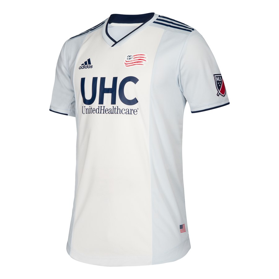
Dallas, New England, Minnesota, Philadelphia away
![]()
Jock tag : something super unique for each one!
Back of the neck : something super unique for each one!
In a nutshell : it’s white kits for everyone!!!1!!1!
 |
 |
 |
 |
No seriously, you get a two year kit cycle, and this is what you shoehorn? Note this should include RSL, but they at least TRIED to do something else.
Sure, there’s “The Reunion”, “The Colonial”, “The Drift”, and “the fan one”, each one with a special name.
You know what, fuck that. Why did the marketing department work harder on selling these vanilla kits than the creative people stuck to find something that might attract and eyeball.
I suppose Dallas put a jock tag of the pattern of the ball at the top of the Reunion Building, but not, say, in the imprint of the shirt? At least you got to add TWO colours of trim.
Philly’s old home look got recycled, had the living shit bleached out of it and gave it to New England. Ugh, you don’t deserve the bib style if you’re going to flush it away like this.
“The Drift”? After snow? Clever!* YOUR HOME KIT IS GREY! YOUR COLOURS ARE GREY AND WHITE! THE MOST VISUALLY DULLING SIDE IN THE LEAGUE!!!
Yes, congrats Philly on getting your Bimbo sponsor (not an insult) to match the colours of your kit, but for what? For this weird ray effect that emanates from the JOCK TAG?!?!
This must be league mandated, because it’s bland, it’s terrible, and clearly the focus group had trouble differentiating between the ‘red’ team and the ‘yellow’ team, when they showed them a 45 second clip in the boardroom.
And like the Toronto FC kit, are these things actually worth your money? Sincerely? Are they? These feel like toss aways, and I’m sure there are some clever representations within the kit, but I will admit, this is a bit of a boil-over from last year’s offerings.
* = Not quite.
Get if : you have difficulty determining which team is yours, you like to be told this is worth it, you want a shirt with a cute theme name you’ll forget after you’ve washed it twice.


February 14, 2019
So. White Kits, huh. I know what I’m getting you for your birthday.
February 15, 2019
For anyone’s birthday, that’s a terrible gift, but keep me in mind… 🙂
February 14, 2019
Thanks for this!!!
A couple thoughts on the above:
– TFC’s kit is so boring. The only redeeming quality is that it’s red. And red is a nice colour.
– The RSL kit is pretty ugly, but I like the collar at least. It could become very interesting though if the ink blot pattern was unique to each player, but I’m sure that’s impossible. Wouldn’t it be cool though if they had 4 or 5 versions of the kit, so the random effect they’re going for actually appeared to be random on the field?
– I actually find San Jose’s to be one of the more interesting kits, but if it’s just a template, then that’s a bummer. But the wave pattern is invisible. I kind of thought you were kidding about it.
– I can’t stand any kit having a nickname. Just fuck off right there marketing people. And snow drifts? Yeah right. The New England one isn’t too bad, but saying it’s inspired by colonial generals just because you put pictures of generals together with players is bullshit. And they really need a new crest.
Anyway thanks for taking the time to put this together. It really is interesting. Do you actually buy a lot of the MLS kits?
February 15, 2019
On some of the blogs I read and follow (footieheadlines.com, footballfashion.org, todosobrecamisetas.com), they’ve highlighted some of the details and provided better pics, but I only pull the images from MLS Store as they’re fairly uniform and not taken from another site that may have more privileged access, hence the notes about San Jose
Not really purchase as many kits as I’d want or like to, mostly due to me being a bigger guy and MLS not wanting my money enough to make them larger, it’s been easy historically. They’re now making larger sizes, but only in the US, and this TFC kit is so disappointing to see as the first one.
I’ve thought about the RSL/unique patterns and I think that one of the main reasons is that now you, effectively, offer customers selection when it comes to the one kit, and if they’re different enough, you might have people who look, willing to buy, but because they don’t see a pattern that they like, they walk away and if some are more aesthetically pleasing than others, you’ll artificially increase leftover stock. It’s my speculation, but it makes sense in my head as a potential customer.
Thanks for reading all the way to the bottom 🙂
February 15, 2019
OK, I see what you mean about the RSL unique kits. Oh well, in an ideal world, we could all get our own personalized white RSL kits with random ink blots. Well, maybe that’s not exactly an ideal world…
I know what you mean about the kit sizes. The few kits that I’ve bought in Germany have made me depressed because I’m a bit on the heavier side, but I have to get like XXL or XXXL with those crazy European sizes. They don’t seem much bigger than my TFC jerseys here though!
February 16, 2019
Testify my friend. So many great kits have been coming out of Germany (hello Koln, Eintract Braunshweig, Fortuna Dusseldorf) and small firms (and exorbitant shipping costs) have been pretty prohibitive to take the leap.
I don’t know if this is of use to you, but it’s a work in progress : Nearly Universal Kit Size Guide v01. I’ve got more to add, just no time to add it. First two pages are the pretty colours and numbers, last pages are the references I used to create it. Also, some of the manufacturer names on the side are clickable to other references where the sizes were obtained from.
February 16, 2019
Wow, thanks for the link! Looks like a lot of work. I can’t believe a 3XL for Nike or Adidas can be a 6 or even 8XL for some other brands!
February 18, 2019
The minimalist look is in this year – less is more, draga.
I do like that SJ home sweater. The black in it would go wonderfully with my formerly black hair.